
Python Setup
To read GOES-16 data you will need the netCDF4 package. To manipulate and plot the data we recommend matplotlib & numpy.
We have setup a Docker container with a suitably configured Jupyter notebook at https://github.com/occ-data/docker-jupyter.
Here is what the import segment looks like for the example code
%matplotlib inline
from netCDF4 import Dataset
import matplotlib
import matplotlib.pyplot as plt
import numpy as np
Reading in GOES-16 NetCDF
Here we will open the dataset and read in the radiance variable, called ‘Rad’ in the file.
g16nc = Dataset('OR_ABI-L1b-RadM1-M3C02_G16_s20171931811268_e20171931811326_c20171931811356.nc', 'r')
radiance = g16nc.variables['Rad'][:]
g16nc.close()
g16nc = None
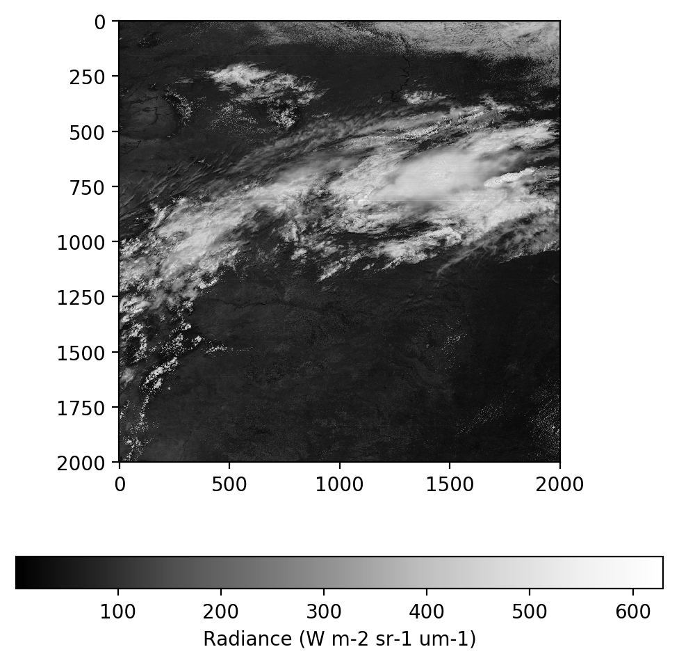
Initial Radiance Plot
Lets plot the data first just to see what we are working with here
fig = plt.figure(figsize=(6,6),dpi=200)
im = plt.imshow(radiance, cmap='Greys_r')
cb = fig.colorbar(im, orientation='horizontal')
cb.set_ticks([1, 100, 200, 300, 400, 500, 600])
cb.set_label('Radiance (W m-2 sr-1 um-1)')
plt.show()
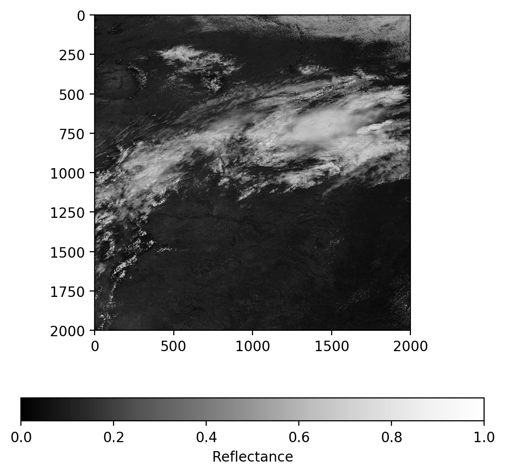
Radiance to Reflectance
It is useful to convert the radiance values from an absolute scale into a relative scale to make them easier to deal with in the following steps. We will use the example formula published by NOAA at http://www.goes-r.gov/products/ATBDs/baseline/Imagery_v2.0_no_color.pdf on page 21.
# Define some constants needed for the conversion. From the pdf linked above
Esun_Ch_01 = 726.721072
Esun_Ch_02 = 663.274497
Esun_Ch_03 = 441.868715
d2 = 0.3
# Apply the formula to convert radiance to reflectance
ref = (radiance * np.pi * d2) / Esun_Ch_02

# Make sure all data is in the valid data range
ref = np.maximum(ref, 0.0)
ref = np.minimum(ref, 1.0)
# Plot reflectance
fig = plt.figure(figsize=(6,6),dpi=200)
im = plt.imshow(ref, vmin=0.0, vmax=1.0, cmap='Greys_r')
cb = fig.colorbar(im, orientation='horizontal')
cb.set_ticks([0, 0.2, 0.4, 0.6, 0.8, 1.0])
cb.set_label('Reflectance')
plt.show()
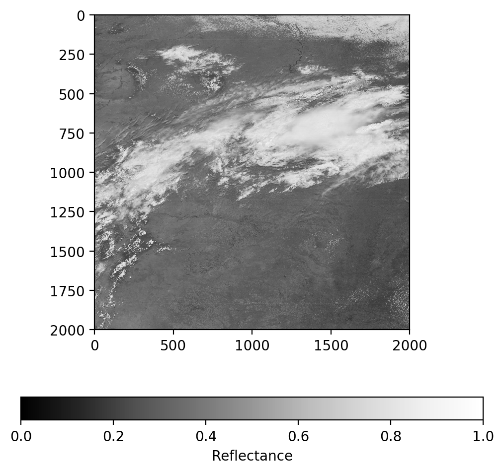
Gamma correction
You’ll notice the image above looks very dark, that is because the values are in linear units. We do a simple gamma correction to adjust this and brighten the image
# Apply the formula to adjust reflectance gamma
ref_gamma = np.sqrt(ref)
# Plot gamma adjusted reflectance
fig = plt.figure(figsize=(6,6),dpi=200)
im = plt.imshow(ref_gamma, vmin=0.0, vmax=1.0, cmap='Greys_r')
cb = fig.colorbar(im, orientation='horizontal')
cb.set_ticks([0, 0.2, 0.4, 0.6, 0.8, 1.0])
cb.set_label('Reflectance')
plt.show()
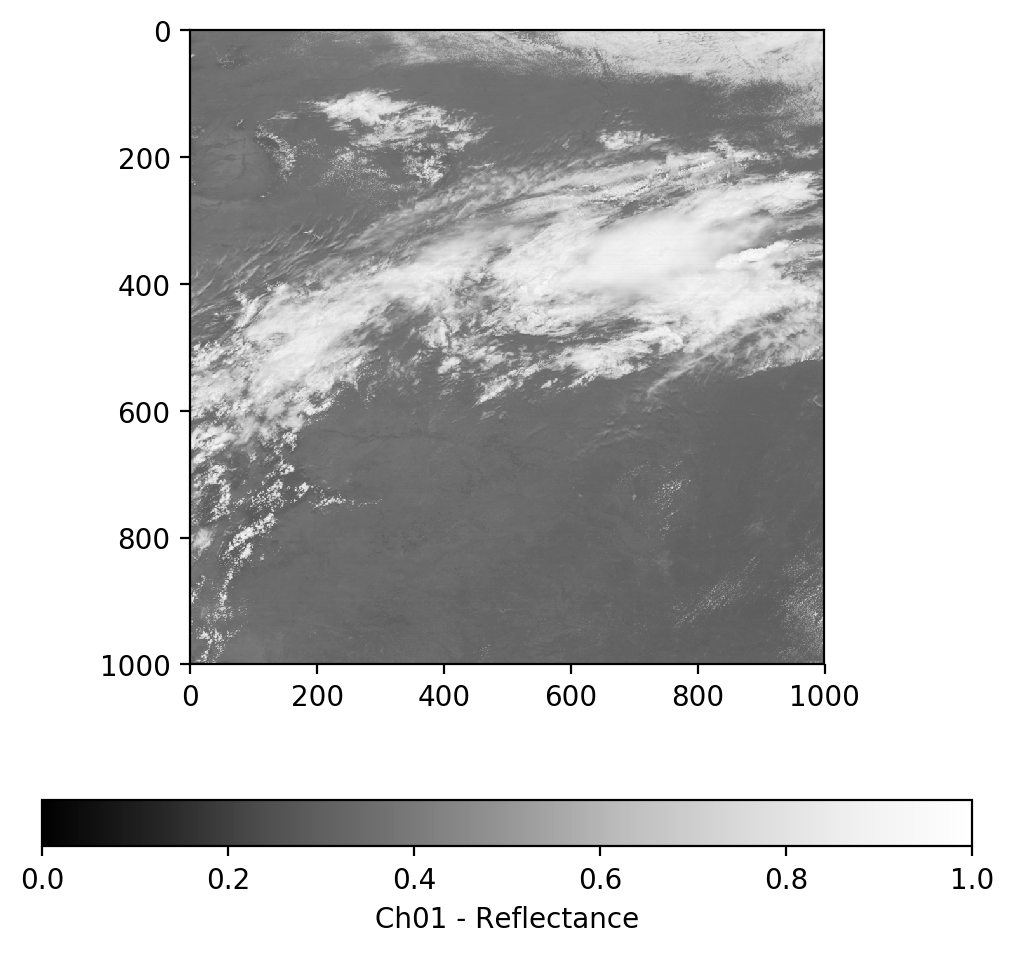
Psuedo-True Color Image
GOES-16 Contains a Blue band and a Red band but no Green band. Fortunately, we can derive a linear relationship between the blue, red, and veggie (near IR) bands to approximate a green band. We will do that here.
# Load Channel 1 - Blue Visible
g16nc = Dataset('OR_ABI-L1b-RadM1-M3C01_G16_s20171931811268_e20171931811326_c20171931811369.nc', 'r')
radiance_1 = g16nc.variables['Rad'][:]
g16nc.close()
g16nc = None
ref_1 = (radiance_1 * np.pi * d2) / Esun_Ch_01
# Make sure all data is in the valid data range
ref_1 = np.maximum(ref_1, 0.0)
ref_1 = np.minimum(ref_1, 1.0)
ref_gamma_1 = np.sqrt(ref_1)
# Plot gamma adjusted reflectance channel 1
fig = plt.figure(figsize=(6,6),dpi=200)
im = plt.imshow(ref_gamma_1, vmin=0.0, vmax=1.0, cmap='Greys_r')
cb = fig.colorbar(im, orientation='horizontal')
cb.set_ticks([0, 0.2, 0.4, 0.6, 0.8, 1.0])
cb.set_label('Ch01 - Reflectance')
plt.show()
# Load Channel 3 - Veggie Near IR
g16nc = Dataset('OR_ABI-L1b-RadM1-M3C03_G16_s20171931811268_e20171931811326_c20171931811371.nc', 'r')
radiance_3 = g16nc.variables['Rad'][:]
g16nc.close()
g16nc = None
ref_3 = (radiance_3 * np.pi * d2) / Esun_Ch_03
# Make sure all data is in the valid data range
ref_3 = np.maximum(ref_3, 0.0)
ref_3 = np.minimum(ref_3, 1.0)
ref_gamma_3 = np.sqrt(ref_3)
# Plot gamma adjusted reflectance channel 3
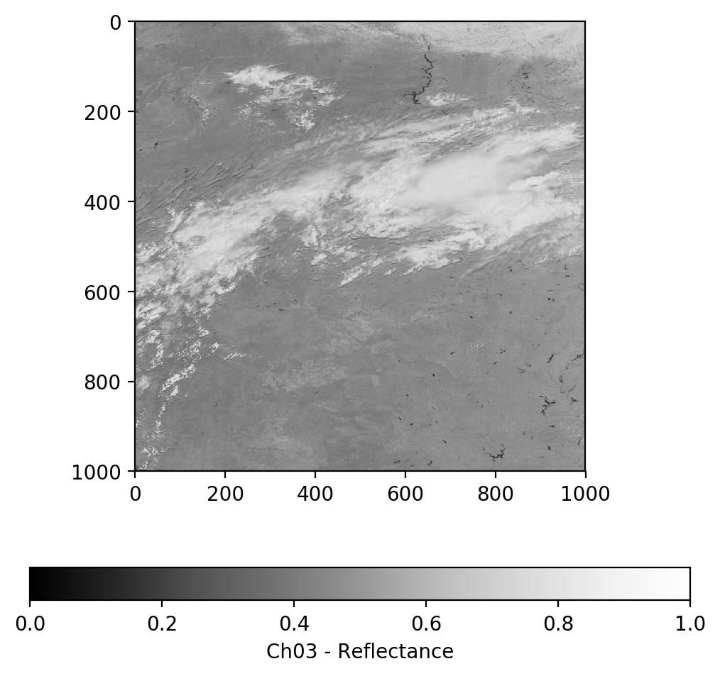
fig = plt.figure(figsize=(6,6),dpi=200)
im = plt.imshow(ref_gamma_3, vmin=0.0, vmax=1.0, cmap='Greys_r')
cb = fig.colorbar(im, orientation='horizontal')
cb.set_ticks([0, 0.2, 0.4, 0.6, 0.8, 1.0])
cb.set_label('Ch03 - Reflectance')
plt.show()
On GOES-16, Band 2 (Red Visible) is 500-meter resolution while Band 1 (Blue Visible) and Band 3 (Veggie IR) are 1,000-meter resolution. In order to combine the 3 bands into an RGB image we will first resample bands 2 to 1000-meter resolution.
# Rebin function from https://stackoverflow.com/questions/8090229/resize-with-averaging-or-rebin-a-numpy-2d-array
def rebin(a, shape):
    sh = shape[0],a.shape[0]//shape[0],shape[1],a.shape[1]//shape[1]
    return a.reshape(sh).mean(-1).mean(1)
ref_gamma_2 = rebin(ref_gamma, [1000, 1000])
Lets make a geocolor image using the veggie near IR band directly in place of green and see how that looks.
geocolor = np.stack([ref_gamma_2, ref_gamma_3, ref_gamma_1], axis=2)
fig = plt.figure(figsize=(6,6),dpi=200)
im = plt.imshow(geocolor)
plt.title('GeoColor - Red - Veggie - Blue')
plt.show()
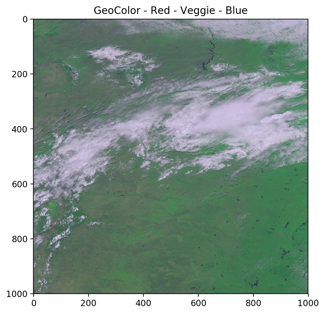
As you can see, the green channel overpowers everything else. We will use a simple linear relationship to adjust the green values to create a psuedo-green channel and produce a better true color image.
# Derived from Planet Labs data, CC > 0.9
ref_gamma_true_green = 0.48358168 * ref_gamma_2 + 0.45706946 * ref_gamma_1 + 0.06038137 * ref_gamma_3
truecolor = np.stack([ref_gamma_2, ref_gamma_true_green, ref_gamma_1], axis=2)
fig = plt.figure(figsize=(6,6),dpi=200)
im = plt.imshow(truecolor)
plt.title('TrueColor - Red - Psuedo-Green - Blue')
plt.show()
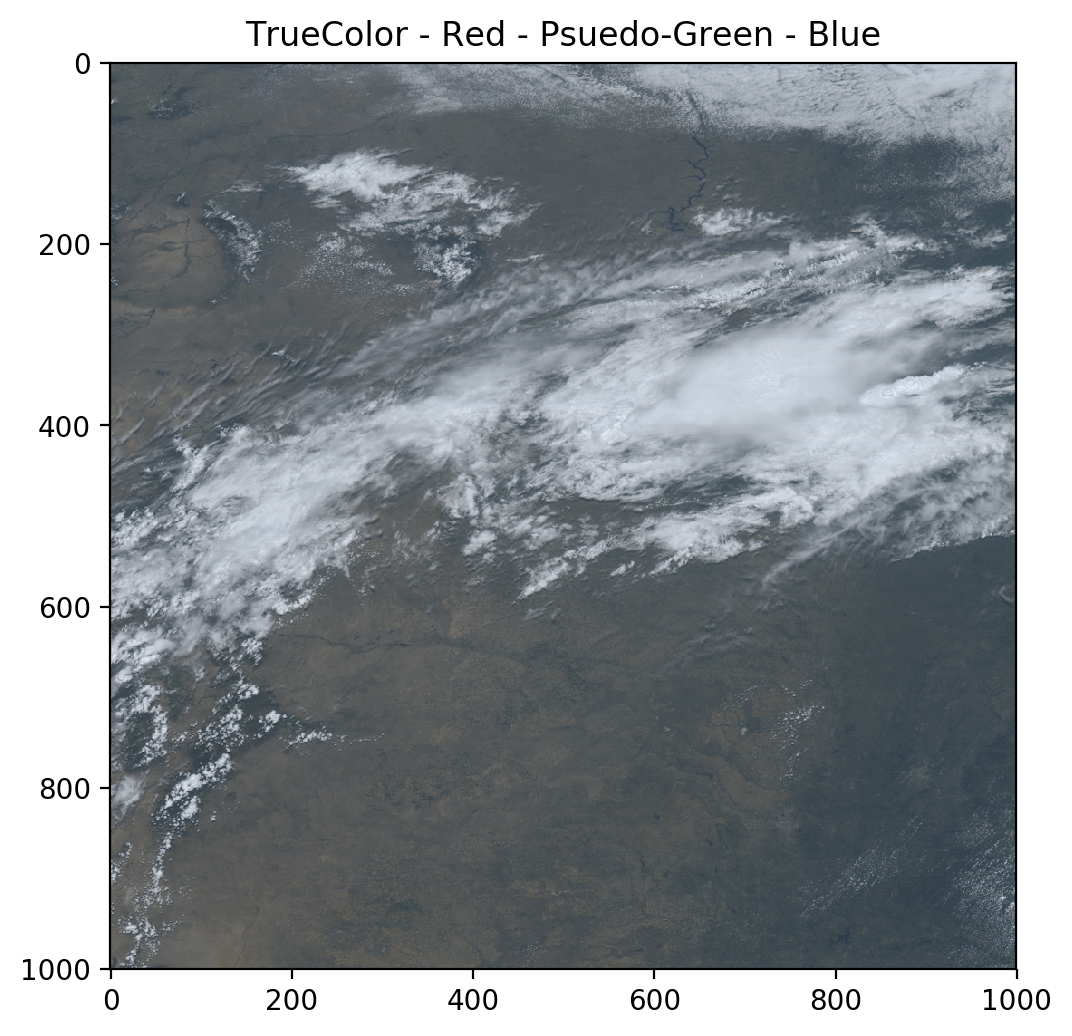
Much better!
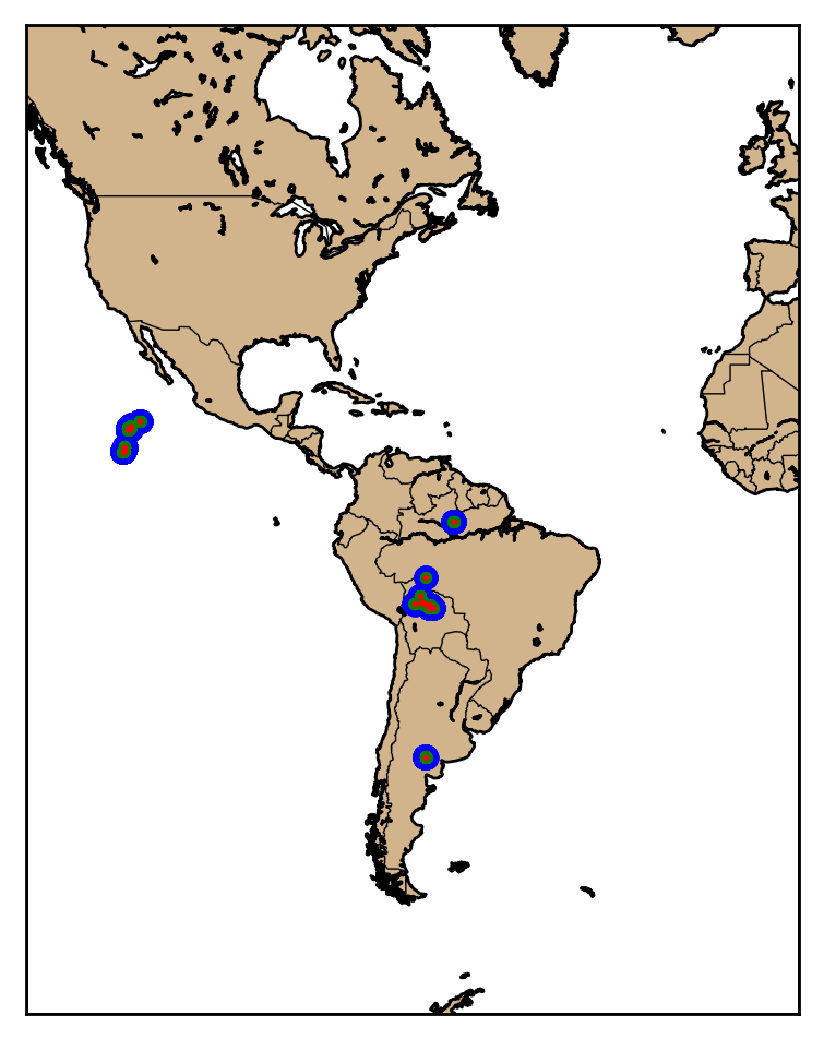
GLM Point Data
The Geostationary Lightning Mapper (GLM) provides point based data of lightning, flashes, groups, and events.
g16glm = Dataset('OR_GLM-L2-LCFA_G16_s20180471253200_e20180471253400_c20180471253551.nc', 'r')
GLM Counts
GLM provides latitude longitude points for events (detections) which are then aggregated into group and flash events. Think about how for a single ground strike in a supercell thunderstorm the intracloud portion of the lightning may extend for many 10s to 100s of miles as the extent of the events. This data is then aggregated to provide cluster centroids which are stored as the flashes.
event_lat = g16glm.variables['event_lat'][:]
event_lon = g16glm.variables['event_lon'][:]

group_lat = g16glm.variables['group_lat'][:]
group_lon = g16glm.variables['group_lon'][:]

flash_lat = g16glm.variables['flash_lat'][:]
flash_lon = g16glm.variables['flash_lon'][:]
GLM Plots
Here we will just plot all of the data on top of each other so you can observed how the data are aggregated together.
fig = plt.figure(figsize=(6,6),dpi=200)
map = Basemap(projection='merc', lat_0 = 0, lon_0 = -70.0,
    resolution = 'l', area_thresh = 1000.0,
    llcrnrlon=-135.0, llcrnrlat=-65.0,
    urcrnrlon=0.0, urcrnrlat=65.0)

map.drawcoastlines()
map.drawcountries()
map.fillcontinents(color = 'tan')
map.drawmapboundary()


# Plot events as large blue dots
event_x, event_y = map(event_lon, event_lat)
map.plot(event_x, event_y, 'bo', markersize=7)

# Plot groups as medium green dots
group_x, group_y = map(group_lon, group_lat)
map.plot(group_x, group_y, 'go', markersize=3)

# Plot flashes as small red dots
flash_x, flash_y = map(flash_lon, flash_lat)
map.plot(flash_x, flash_y, 'ro', markersize=1)

plt.show()
Jupyter Notebook
The notebook and example data shown here are available at https://github.com/occ-data/goes16-jupyter